Decide what the material should do
Does the composition need to draw attention, soften a corner or add a small detail to a shelf? The answer helps determine scale. A full hydrangea head contributes concentrated volume; branching foliage creates a different outline. Start with that role before choosing the colour.
Look at texture as well as colour
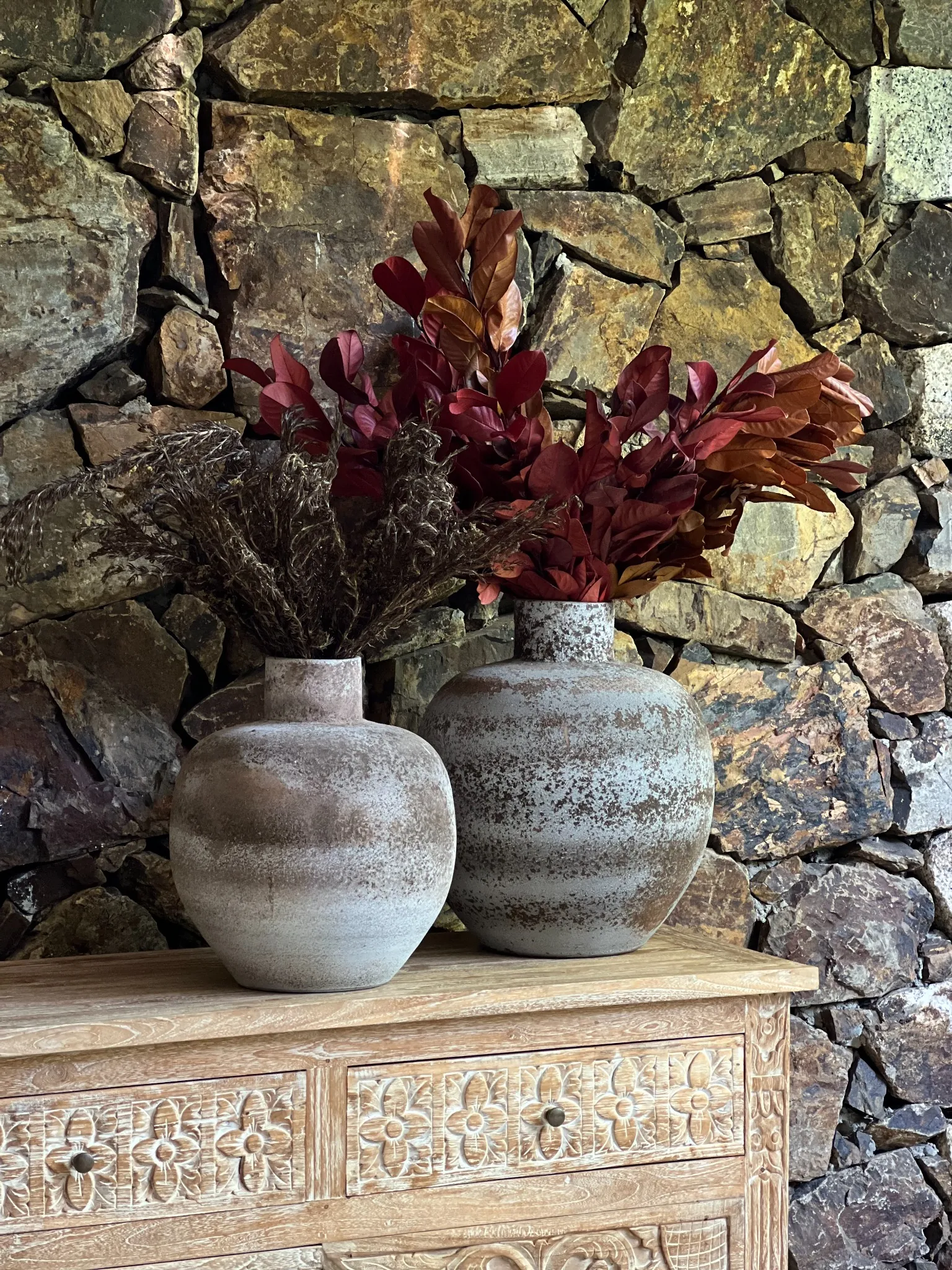
A flat colour sample tells only part of the story. Petal surfaces catch light differently from broad leaves; the depth of a flower head and the gaps between branches affect how solid or airy a composition looks. Assess these features alongside the room’s finishes, not only against a plain photographic background.
Check the colour in the room
Evaluate the flowers beside the finishes they will accompany. A colour photographed on white can read differently against stone, wood or a dark wall. Look at the composition in the intended light and at more than one time of day. Current colour availability should be checked in the catalogue before the design is finalised.
A beautiful spot is not always a suitable spot
Keep preserved materials indoors, away from direct sun, strong heat and high humidity. Within those limits, look at the layout: allow room around the botanical silhouette and keep delicate parts clear of doors, seating and busy routes. The care guide covers cleaning and handling.
When the project needs more than cut stems
Preserved plants offer branching forms and a more defined silhouette than a loose selection of cut stems. Pier Vino is exploring this direction through eucalyptus trees. They should be evaluated as individual botanical forms, with dimensions and availability confirmed for the project, rather than treated as interchangeable copies.